Thanks to Jesse for the introduction, and the incredible opportunity to blog at Put This On!
I took some time to think about what my first post would be, and I decided that I would write something that’s a good reflection of what I aim to do in the future – bring a little of own perspective and build on the existing PTO wisdom. Thus, for the first post, I’d like to begin by talking about how to choose a cardigan, something that I don’t believe has been covered here before.
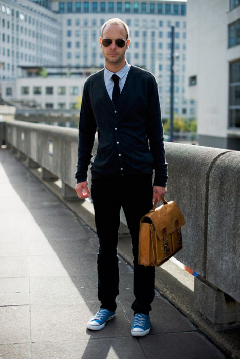
Cardigans are great for when we transition out of Winter and into Spring. They give you an additional layer of warmth for when the sun’s out, but it’s still slightly chilly. As basic as a cardigan is, however, it seems many men still don’t buy the right ones. The most common mistake is buying cardigans that sit too close to your shoulders. Instead, you should aim for ones that fit a bit closer to your collar, so that it doesn’t look like your sweater is about to fall off or become a tube top. This isn’t just a matter of where the shoulder seams sit on you; it’s a matter of how the the opening on the cardigan is cut. I’ve Photoshopped the following photograph to show you the difference.
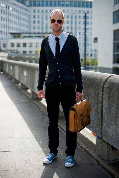
Isn’t that much better? Here’s another example. The man on the left has a fairly low hanging cardigan, so I’ve pushed it higher up on his shoulders and made them sit closer to his collar. In addition, I’ve taken the opportunity to illustrate a few other stylistic points. First, I’ve given his pieces a bit more contrast by turning his shirt light blue and his tie navy. This makes each of his pieces distinguish themselves a bit more while still maintaining some simple color harmony. I’ve written about the importance of contrast before here, for those interested in reading more about the subject. Second, I took out the skulls and bones motif on his tie, as simple and basic ties are always much better than gimmicky ones. Third, I’ve made his tie a bit wider, because I think they make him look a bit more mature. Lastly, I’ve straightened up the top of his shirt, so that white from under his placket doesn’t peek out. The problem with shirts with all these contrasting details is that they can sometimes highlight a poor fit, so I think they’re best avoided.
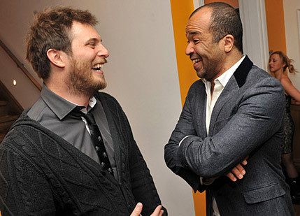
There’s a lot packed into the last Photoshop, but much of it is actually old Put This On wisdom. Jesse has talked before about the value of basic neckties, as well as blue button-up shirts. Given his appreciation for classic menswear, I have a hunch that he’d also favor slightly wider ties over skinny ones. In the end, this picture is really just illustrating how much better one can look with some of the tips Put This On has been giving all along; I’m just adding the bit regarding properly fitting cardigans. If you didn’t believe that PTO could make you a better-dressed man, hopefully this is proof.
In the future, I’ll try to do a few more of these Photoshops to illustrate different stylistic tips (including ones you’ve been reading about at this site). I’ll also round up various items you may want to consider for your wardrobe, and talk about things such as tailoring, how clothes are made, and a little menswear history. Hopefully you’ll enjoy my posts, and thanks for having me on board!